Kōen Coffee
Concept ProjectA coffee brand with a slow-roast soul
Identity, packaging and launch campaign for a specialty coffee roaster — a park-inspired mark, a warm earthy palette and a system that scales from cups to cafés.
- Services
- Branding & Marketing, Media & Ads
- Industry
- Restaurants
- Year
- 2026
1 system
Logo, type, colour, packaging and signage
40+
Launch assets designed for social and store
3 weeks
Planned identity sprint
* Concept project for a fictional brand. Figures are design targets and projections, not client results.
The challenge
Kōen (Japanese for "park") is a fictional specialty roaster opening its first café. It needed a brand that felt calm and crafted without falling back on the same kraft-paper look as every other third-wave café.
Our approach
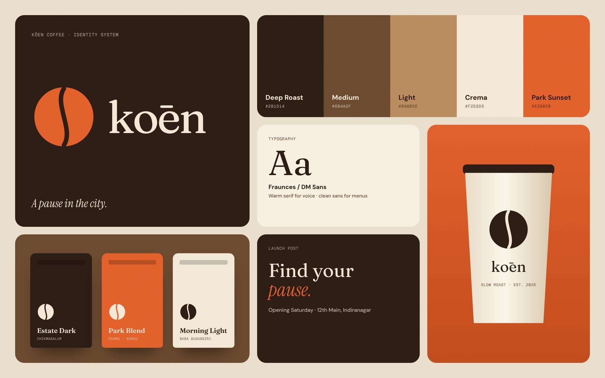
We built the positioning around the idea of a pause in the city: a short break with good coffee. The mark is a circle split by a single path, which reads as both a park and a coffee bean. Colour comes from roasting stages, from green bean to deep roast, with a sunset orange accent.
The solution
A complete identity system: wordmark and symbol, a type pairing, a colour palette, bag and cup packaging, café signage and a launch content kit with reels, posts and in-store menus. Every asset was built on a grid so the team can make new ones in Figma without a designer.
Projected impact
Design targets, not client results: a recognisable shelf presence, a consistent look across every touchpoint, and a launch kit ready on day one.
Next project
Pulse AthleticReels that earn the first three seconds